
Responsive web design has become essential to creating user-friendly and engaging websites. With the increasing number of devices being used to access the internet, web designers must consider different screen sizes and resolutions when designing websites.
Introduction
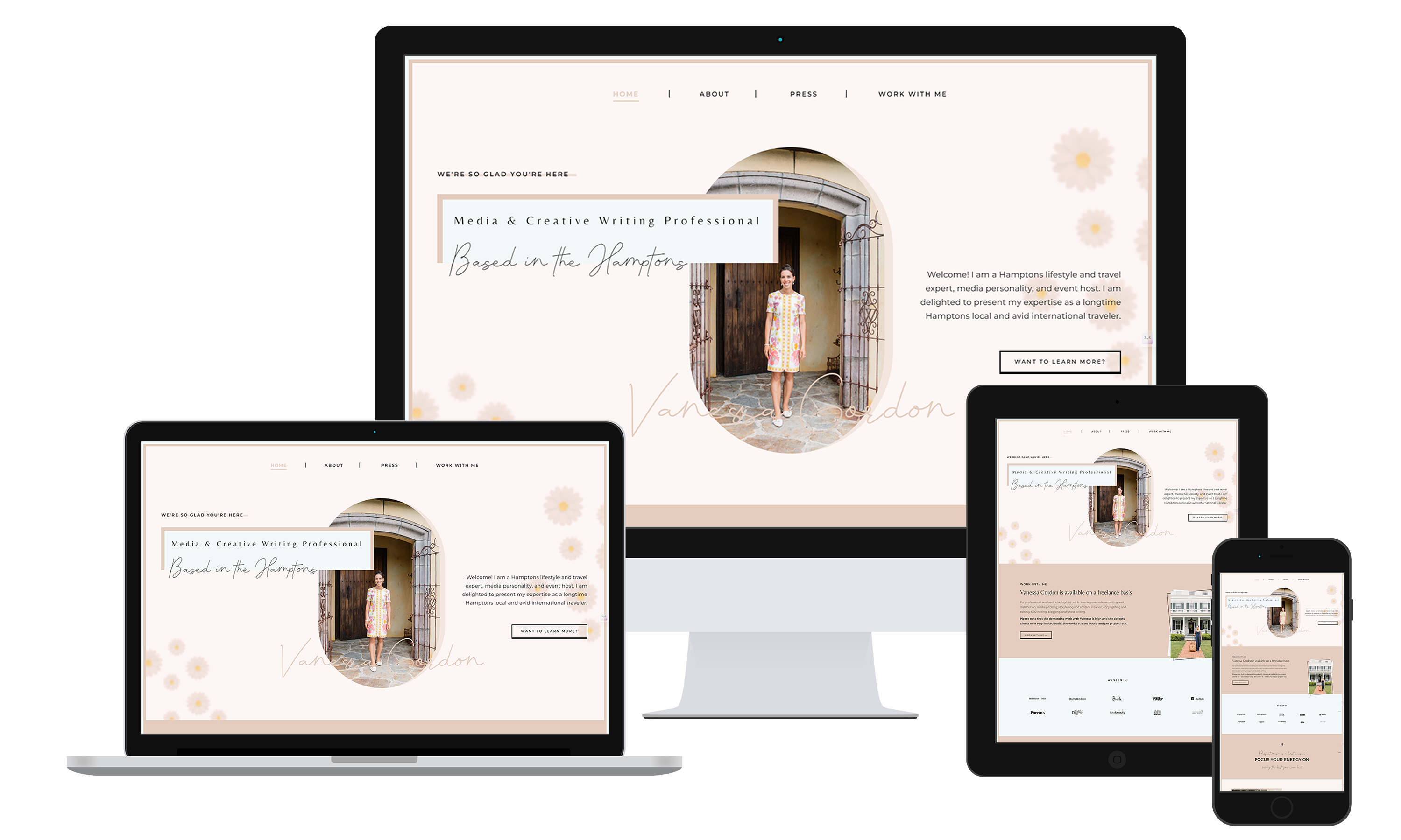
Responsive web design refers to designing websites that adapt to different screen sizes and resolutions, ensuring that they display optimally on different devices. This technique allows websites to provide a consistent user experience across different devices, regardless of their screen size or resolution.
Current Trends in Responsive Web Design
- Fluid Grids and Media Queries
One of the key techniques in responsive web design is the use of fluid grids and media queries. Fluid grids allow website elements to resize and rearrange themselves based on the screen size, ensuring that content remains readable and visually appealing on all devices. Media queries allow web designers to specify different CSS styles for different screen sizes, further enhancing the user experience.
- Adaptive Images
Another trend that has gained prominence in responsive web design is adaptive images. This technique involves resizing and optimizing images to fit different screen sizes, resulting in faster loading times and better user experience. By resizing images based on screen size, web designers can avoid loading unnecessarily large images, which can slow down the website’s performance.
- Touch-Friendly Designs
With the increasing use of mobile devices, touch-friendly designs have become increasingly popular. Touch-friendly designs take into account the capabilities of touchscreen devices, ensuring that website elements are easily accessible and usable. Techniques such as larger tap targets and gestures-based interactions can enhance the user experience on touchscreen devices.
- Progressive Web Apps (PWAs)
Progressive Web Apps (PWAs) are a relatively new concept that combines the best of both web applications and regular websites. PWAs offer a native-like experience on mobile devices, providing features like push notifications, offline functionality, and home screen shortcuts. By leveraging the capabilities of modern web browsers, PWAs provide a faster and smoother user experience on smartphones.
Best Practices for Responsive Web Design
To ensure optimal user experience across devices, it is important to follow certain best practices when designing responsive websites. Here are some key considerations:
- Mobile-Friendly Layout: Design websites with mobile-friendly layouts, ensuring that content is easily readable and usable on a small screen. Avoid using cluttered layouts or unnecessary elements that can overwhelm users on smaller devices.
- Responsive Navigation: Implement responsive navigation techniques that adapt based on screen size. This allows users to easily navigate through the website, even on a small screen.
- Responsive Typography: Use responsive typography to adjust font sizes and line heights based on screen size. This allows content to be easily readable and visually appealing on all devices.
- Responsive Image Optimization: Optimize images for different screen sizes, reducing file sizes without compromising image quality. This improves loading times and ensures a smooth user experience.
- Responsive Forms: Design responsive forms that adapt to different screen sizes. This allows users to easily enter information on small screens, reducing the chances of errors.
- Mobile-First Approach: Begin the design process by designing for the mobile experience, and then adapt for larger screens. This approach ensures that websites provide a high-quality user experience across all devices.
Conclusion
Responsive web design has become crucial in creating user-friendly and engaging websites. By implementing the latest trends and best practices, web designers can ensure optimal user experience across devices. By considering different screen sizes and resolutions, web designers can create websites that adapt seamlessly and provide a seamless experience for users, regardless of their device of choice.